Disclaimer: This post was generated using AI. The explanations provided are AI-generated, while the code is written by the author and is intended to function as described.
Background
In today’s web design landscape, interactivity plays a crucial role in enhancing user experience. A well-designed button can capture attention and encourage user engagement. In this article, I’ll walk you through creating an interactive button that expands with a growing circle effect on hover. This effect not only looks visually appealing but also adds a layer of fun to the user interface.
What Are We Going To Create?
See the Pen Button hover effect post by TheFakeCreator (@Sanskar-the-styleful) on CodePen.
How It Works
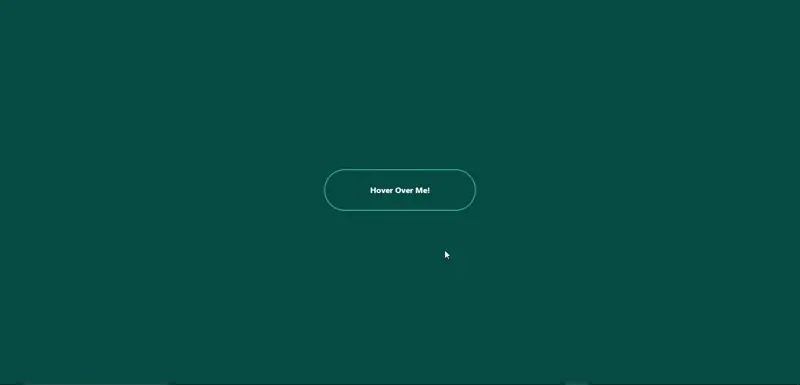
The button we’ll create is simple yet effective. When the user hovers over the button, a circle will expand from the center, creating a smooth filling effect. This interaction is achieved using just HTML and CSS, making it accessible for beginners and efficient for seasoned developers.
Writing the HTML Structure
First, let’s create the HTML structure for our button. We’ll need a container for the button and two div elements: one for the button text and another for the expanding circle.
    <div id="main">
        <div id="btn">
            <div id="btntext">Hover Over Me!</div>
            <div id="circle"></div>
        </div>
    </div>
- The
#main div serves as a wrapper to center the button on the page.
- The #btn div acts as the button itself, containing the text and the circle.
Styling with CSS
Next, we’ll style our button and the expanding circle. The CSS will not only define the appearance of the button but also handle the hover effect.
1. Basic Reset and Layout
We start by resetting the margins and paddings and then define the layout for our button.
    * {
        margin: 0;
        padding: 0;
    }

    #main {
        height: 100vh;
        width: 100vw;
        display: flex;
        justify-content: center;
        align-items: center;
        background-color: rgb(0, 71, 71);
    }
2. Button Styles
We set the dimensions, border, and other properties for the button.
    #btn {
        position: relative; /* Enables absolute positioning of child elements */
        display: flex;
        justify-content: center;
        align-items: center;
        height: 80px;
        width: 300px;
        border-radius: 40px;
        border: 1px solid aqua;
        overflow: hidden; /* Hides any overflowed content, like the circle when not hovered */
        font-family: ebrima;
        font-weight: bold;
        cursor: pointer;
        z-index: 1; /* Ensures the button appears above the circle */
    }
-
-
-
Position: relative: This property allows us to position the child elements (like the circle) absolutely in relation to the button itself. Without this, the circle would not position correctly.-
Overflow: hidden: This hides any content that overflows the button's dimensions. It ensures that the circle does not show outside the button area when it expands.-
Z-index: 1: This places the button above other elements with a lower z-index, ensuring it is interactive and visible.
3. Text and Circle Styles
The text color changes on hover, and the circle is initially hidden.
    #btntext {
        z-index: 1; /* Keeps the text above the circle */
        color: white;
        transition: 0.2s; /* Smooth transition for color change */
    }

    #circle {
        position: absolute; /* Positions the circle relative to the button */
        background-color: aqua;
        height: 10px;
        width: 10px;
        border-radius: 50%; /* Makes the circle round */
        transition: 0.3s; /* Smooth transition for scale change */
        z-index: -1; /* Places the circle behind the button text */
        visibility: hidden; /* Hides the circle until hovered */
    }
-
-
Position: absolute: This allows the circle to be positioned exactly where we want it within the button, regardless of other elements.-
Visibility: hidden: This keeps the circle hidden until the user hovers over the button. This ensures that it doesn’t take up space when not in use.
4. Hover Effect
Finally, we define the hover effect that makes the circle visible and expands it when the button is hovered over.
    #btn:hover > #circle {
        visibility: visible; /* Shows the circle when hovering */
        transform: scale(30); /* Expands the circle */
    }

    #btn:hover > #btntext {
        color: black; /* Changes text color on hover */
    }
Conclusion
By following these steps, you can create an engaging hover button that enhances the user interface of your web projects. This technique not only adds a dynamic element but also encourages user interaction, making your website more enjoyable to navigate.
See the Pen Button hover effect post by TheFakeCreator (@Sanskar-the-styleful) on CodePen.
Feel free to experiment with the styles and effects to fit your project's aesthetic. Happy coding!
What More Can You Add?
Although we’ve covered the basics, there’s still plenty of room for creativity when it comes to interactive buttons. You can experiment with different behaviors—like adding a pulsating effect, changing the background color on hover, or implementing a ripple effect for a more engaging interaction.
This article has given you the foundational knowledge needed to create an interactive button. Now it’s your turn to get creative and build something that stands out. Don’t hesitate to explore further. Use the internet for inspiration, refer to documentation when needed, and leverage AI tools to help troubleshoot or understand tricky concepts. The best way to learn is by experimenting and trying things on your own. So, keep pushing boundaries and keep creating!
-----
Author - Sanskar Gupta (TheFakeCreator)
Author - Sanskar Gupta (TheFakeCreator)