Background
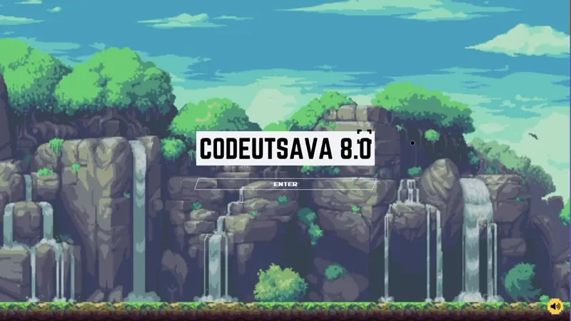
We were working on our college coding club’s website, and this year, the
theme was
Pixel Art
. With the theme in mind, we were aligning every design element accordingly.
When we got to the cursor design, we started exploring options that would
fit seamlessly with the pixelated aesthetic.
That’s when I had an idea—why not make the cursor not only thematic but also
interactive? I proposed creating a crosshair-style cursor that would change
dynamically based on user interaction. Specifically, when hovering over a
button or link, the cursor would expand to match the size of the container,
pulsing, just like you’d see in video games. This would add a fun and
engaging element, bringing the pixel art theme to life in an unexpected way.
How We Are Going To Proceed
I’ll walk you through the entire process—from the initial concept to the
final development of this interactive cursor. We’ll approach it as if we’re
building it from scratch, assuming a familiarity with JavaScript.
Ideation
I’m envisioning a cursor that resembles a crosshair. It would have a small
dot at the center, surrounded by a rectangle with only the corners outlined,
giving it a sharp and minimal look.
To achieve this, we can create two distinct
divs—one for the central dot (we’ll
give it the id #cursor-dot) and
another for the outer rectangle (id
#cursor-outline). This sets up the
basic structure for our custom cursor.
Next, we’ll need to style them and use JavaScript to dynamically update the
positions of both
divs based on the
mouse’s movement. This forms the foundation of how we’ll build our
interactive cursor.
Writing up the basic HTML Structure
Just create the divs with id
#cursor-dot and
#cursor-outline
See the Pen Untitled by TheFakeCreator (@Sanskar-the-styleful) on CodePen.
The Styling
The CSS part is particularly important because some of the styling is
crucial for the upcoming JavaScript functionality, so pay close attention to
this section.
First, we’ll turn the
#cursor-dot into a beautiful little
black circle by applying the necessary styles. You can check out the code
snippet below for the details.
See the Pen Untitled by TheFakeCreator (@Sanskar-the-styleful) on CodePen.
Since we want to keep the cursor within the viewport, we’ll set its
position: fixed;. This ensures that
the cursor stays inside the visible area of the page. With the position
property defined, we can now assign the
top and
left properties. I’ve set both to
50%, so the cursor starts from the center of the page.
One of the most important aspects is the
transform: translate(-50%, -50%);.
This transformation adjusts the element so that the circle’s center aligns
with the top and left properties. Typically, those properties are calculated
from the top-left corner of an element, but with this transformation, we
ensure that they are now calculated from the center of the circle.
Another crucial property is
pointer-events: none;. This is key
to allowing the cursor to interact with other elements on the webpage.
Without this, when we move the dot with the mouse, the cursor would remain
on top of the div and prevent any interaction with other elements. By
setting pointer-events: none;, we
ensure the cursor ignores the dot and passes through to interact with the
rest of the page.
These are the most important considerations for the
#cursor-dot. The rest of the styling
is primarily for aesthetics. Now, let's move on to styling the
#cursor-outline. (Make sure to set a
high z-index to keep the cursor consistently on top.)
As you scroll down through the code, you’ll notice the styling for the
#cursor-outline. Most of the styling
is similar to that of the
#cursor-dot, but the key challenge
here was how to create the corner-only border effect. As you may know, the
standard border property doesn’t
offer a way to achieve this. So, how did we do it? I ran into the same issue
while working on it and eventually found a helpful StackOverflow article
that offered a solution. You can check it out
here.
The solution uses a clever application of linear gradients to create the
corner borders. This method works perfectly for our use case since we’ll be
dynamically changing the height and width of the outline later on. Using
this approach ensures that the design remains intact and doesn’t lose its
aesthetic as the outline resizes.
You can play with the values of the linear-gradient in the codepen to get an
essence of how this code is working. Basically the 6px that are written
changes the boldness of the border, and background-size handles how long
will the lines be.
Defining the logic
The key element here is the JavaScript, as it controls all the behavior of
the custom cursor.
First, what’s our goal? We want the dot and the outline to follow the mouse
movements. To start, we need to get both elements in our JavaScript code. We
can do this using
document.getElementById("id of the element here").
See the Pen Untitled by TheFakeCreator (@Sanskar-the-styleful) on CodePen.
With this, we’ve successfully accessed our elements in JavaScript. Now, we
need to update their position according to the mouse movements. To do this,
we’ll use the
mousemove event
listener. After this just set the left and top style to the current position
of the mouse by using clientX and
clientY and we are good to go.
At this point, the dot should move along with the mouse. we will apply the
same thing to cursor outline as well atleast for now. And then the code will
be something like this.
See the Pen CB4 by TheFakeCreator (@Sanskar-the-styleful) on CodePen.
Now, to achieve a smooth transition between two positions for the cursor
outline, we define a function called
At this point we almost achieved what we aimed for right! Now as we reached
here i will recommend you to set
animateCursorOutline() (check the
code snippet above for details). However, if we call this function directly
inside the mousemove event listener,
the position of the cursor outline won’t update properly. Instead, it will
start glitching—constantly moving back and forth between positions, creating
an undesirable effect.
document.addEventListener("mousemove", (e) => {
  const posX = e.clientX;
  const posY = e.clientY;
  cursorDot.style.left = posX + "px";
  cursorDot.style.top = posY + "px";
  cursorOutline.style.left = posX + "px";
  cursorOutline.style.top = posY + "px";
  animateCursorOutline(posX, posY, (duration = 500)); //This should not be done
});
const updateCursorOutline = (posX, posY, cursor) => {
  cursor.style.left = posX + "px";
  cursor.style.top = posY + "px";
  animateCursorOutline(posX, posY, 500);
};

const animateCursorOutline = (posX, posY, duration = 500) => {
  cursorOutline.animate(
    {
      left: posX + "px",
      top: posY + "px",
    },
    duration
  );
};

document.addEventListener("mousemove", (e) => {
  const posX = e.clientX;
  const posY = e.clientY;
  cursorDot.style.left = posX + "px";
  cursorDot.style.top = posY + "px";
  cursorOutline.style.left = posX + "px";
  cursorOutline.style.top = posY + "px";
  updateCursorOutline(posX, posY, cursorOutline); //This be done
});
See the Pen CB5 by TheFakeCreator (@Sanskar-the-styleful) on CodePen.
*{
  cursor:none !important;
}
After this, we need to focus on the
cursor's interaction with buttons and links
. How can we achieve this?
Thought:
.button and select all elements with
this class in our JavaScript file. For each element, we can check if the
cursor is hovering over it. If it is, we can dynamically adjust the size of
the cursor outline to match the button. When the cursor leaves the button,
we'll reset the outline to its default size. This approach allows us to
create responsive interactions based on cursor movements over specific
elements.
First, we’ll retrieve all the buttons using
querySelectorAll():
const buttons = document.querySelectorAll('.button'); forEach loop on
this array of buttons to check whether the mouse enters or leaves each
button by passing an event parameter. To help manage this state, we’ll
create a flag named isHovering and
set its default value to false. When
the mouse enters the button, we’ll set it to
true, and when it leaves, we’ll
revert it back to false. This flag
will assist us further in the code.
	const buttons = document.querySelectorAll('.button');
    let isHovering = false;

    buttons.forEach(e => {
        e.addEventListener('mouseenter', () => {
            isHovering = true;
            let buttonRect = e.getBoundingClientRect();
        });

        e.addEventListener('mouseout', () => {
            isHovering = false;
        });
    });
e as a parameter and employed
getBoundingClientRect() to retrieve
essential data for positioning and resizing the cursor outline. This data
includes the button's left and top positions, as well as its height and
width. Next, we’ll create a function to update the size and position of the
cursor outline based on this information.
	const buttons = document.querySelectorAll('.button');
    let isHovering = false;

    //Function to handle the cursor-outline behaviour
    const handleCursorHoverBehaviour = (leftPos, topPos, btnHeight, btnWidth) => {
        cursorOutline.height = btnHeight + 'px';
        cursorOutline.width = btnWidth + 'px';
        updateCursorOutline((leftPos + (btnWidth / 2)), (topPos + (btnHeight / 2)), cursorOutline.item);
    }

    buttons.forEach(e => {
        e.addEventListener('mouseenter', () => {
            isHovering = true;
            let buttonRect = e.getBoundingClientRect();
            handleCursorHoverBehaviour(buttonRect.left, buttonRect.top, buttonRect.height, buttonRect.width);

        });

        e.addEventListener('mouseout', () => {
            isHovering = false;
        });
    });
mousemove event listener
to align with the current cursor behavior.
	document.addEventListener('mousemove', (e) => {
        const posX = e.clientX;
        const posY = e.clientY;
        cursorDot.style.left = posX + "px";
        cursorDot.style.top = posY + "px";

        if (!isHovering) {
            updateCursorOutline(posX, posY, cursorOutline.item);
            cursorOutline.height = cursorOutline.defaultDimension + 'px';
            cursorOutline.width = cursorOutline.defaultDimension + 'px';
        }
    });
updateCursorOutline() function
inside a conditional statement, ensuring it only runs when the mouse is
outside of a button. This prevents the cursor outline from moving while
hovering over a button, allowing for smoother interaction. With this
adjustment, our custom cursor is complete and should function as intended.
See the Pen CB6 by TheFakeCreator (@Sanskar-the-styleful) on CodePen.
Although we’ve covered the basics, there’s still plenty of room for
creativity when it comes to custom cursors. You can experiment with
different behaviors—like making the dot grow when hovering over a link, or
designing something even more unique and visually stunning. This article has
given you the foundational knowledge needed to create a custom cursor. Now
it’s your turn to get creative and build something that stands out. Don’t
hesitate to explore further. Use the internet for inspiration, refer to
documentation when needed, and leverage AI tools to help troubleshoot or
understand tricky concepts. The best way to learn is by experimenting and
trying things on your own. So, keep pushing boundaries and keep creating!
-----
Author - Sanskar Gupta (TheFakeCreator)


