Loading......

Where Code Meets 

Divinity

You

At Diwine Devs, we believe that web development is more than just writing code—it's an art form inspired by the divine. Our mission is to blend technical expertise with creative vision, crafting web experiences that are both functional and beautiful. Join us on a journey where innovation meets inspiration, and every project is a masterpiece touched by the essence of divinity. Explore our insights, tutorials, and projects to elevate your coding skills to a higher realm.
Explore Our Blogs arrow_outward

Our Latest Creations

Creating an Interactive Hover Button with CSS

Disclaimer: This post was generated using AI. The explanations provided are AI-generated, while the code is written by the author and is intended to function as described.
Background
In today’s web design landscape, interactivity plays a crucial role in enhancing user experience. A well-designed button can capture attention and encourage user engagement. In this article, I’ll walk you through creating an interactive button that expands with a growing circle effect on hover. This effect not only looks visually appealing but also adds a layer of fun to the user interface.
What Are We Going To Create?

See the Pen Button hover effect post by TheFakeCreator (@Sanskar-the-styleful) on CodePen.

How It Works
Cursor entering a button
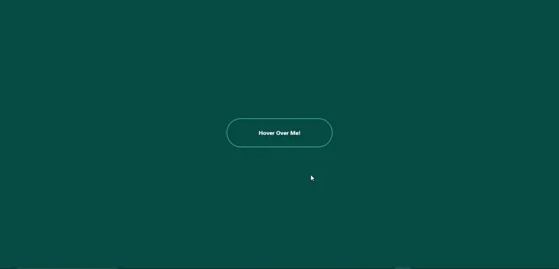
The button we’ll create is simple yet effective. When the user hovers over the button, a circle will expand from the center, creating a smooth filling effect. This interaction is achieved using just HTML and CSS, making it accessible for beginners and efficient for seasoned developers.
Writing the HTML Structure
First, let’s create the HTML structure for our button. We’ll need a container for the button and two div elements: one for the button text and another for the expanding circle.
 
    <div id="main">
        <div id="btn">
            <div id="btntext">Hover Over Me!</div>
            <div id="circle"></div>
        </div>
    </div>
  
- The #main div serves as a wrapper to center the button on the page. - The #btn div acts as the button itself, containing the text and the circle.
Styling with CSS
Next, we’ll style our button and the expanding circle. The CSS will not only define the appearance of the button but also handle the hover effect.
1. Basic Reset and Layout
We start by resetting the margins and paddings and then define the layout for our button.
 
    * {
        margin: 0;
        padding: 0;
    }

    #main {
        height: 100vh;
        width: 100vw;
        display: flex;
        justify-content: center;
        align-items: center;
        background-color: rgb(0, 71, 71);
    }
  
2. Button Styles
We set the dimensions, border, and other properties for the button.
 
    #btn {
        position: relative; /* Enables absolute positioning of child elements */
        display: flex;
        justify-content: center;
        align-items: center;
        height: 80px;
        width: 300px;
        border-radius: 40px;
        border: 1px solid aqua;
        overflow: hidden; /* Hides any overflowed content, like the circle when not hovered */
        font-family: ebrima;
        font-weight: bold;
        cursor: pointer;
        z-index: 1; /* Ensures the button appears above the circle */
    }
  
- Position: relative: This property allows us to position the child elements (like the circle) absolutely in relation to the button itself. Without this, the circle would not position correctly.
- Overflow: hidden: This hides any content that overflows the button's dimensions. It ensures that the circle does not show outside the button area when it expands.
- Z-index: 1: This places the button above other elements with a lower z-index, ensuring it is interactive and visible.
3. Text and Circle Styles
The text color changes on hover, and the circle is initially hidden.
 
    #btntext {
        z-index: 1; /* Keeps the text above the circle */
        color: white;
        transition: 0.2s; /* Smooth transition for color change */
    }

    #circle {
        position: absolute; /* Positions the circle relative to the button */
        background-color: aqua;
        height: 10px;
        width: 10px;
        border-radius: 50%; /* Makes the circle round */
        transition: 0.3s; /* Smooth transition for scale change */
        z-index: -1; /* Places the circle behind the button text */
        visibility: hidden; /* Hides the circle until hovered */
    }
  
- Position: absolute: This allows the circle to be positioned exactly where we want it within the button, regardless of other elements.
- Visibility: hidden: This keeps the circle hidden until the user hovers over the button. This ensures that it doesn’t take up space when not in use.
4. Hover Effect
Finally, we define the hover effect that makes the circle visible and expands it when the button is hovered over.
 
    #btn:hover > #circle {
        visibility: visible; /* Shows the circle when hovering */
        transform: scale(30); /* Expands the circle */
    }

    #btn:hover > #btntext {
        color: black; /* Changes text color on hover */
    }
  
Conclusion
By following these steps, you can create an engaging hover button that enhances the user interface of your web projects. This technique not only adds a dynamic element but also encourages user interaction, making your website more enjoyable to navigate.

See the Pen Button hover effect post by TheFakeCreator (@Sanskar-the-styleful) on CodePen.

Feel free to experiment with the styles and effects to fit your project's aesthetic. Happy coding!
What More Can You Add?
Although we’ve covered the basics, there’s still plenty of room for creativity when it comes to interactive buttons. You can experiment with different behaviors—like adding a pulsating effect, changing the background color on hover, or implementing a ripple effect for a more engaging interaction.
This article has given you the foundational knowledge needed to create an interactive button. Now it’s your turn to get creative and build something that stands out. Don’t hesitate to explore further. Use the internet for inspiration, refer to documentation when needed, and leverage AI tools to help troubleshoot or understand tricky concepts. The best way to learn is by experimenting and trying things on your own. So, keep pushing boundaries and keep creating!
-----
Author - Sanskar Gupta (TheFakeCreator)

How I Made The CodeUtsava 8.0 Cursor

Background
We were working on our college coding club’s website, and this year, the theme was
Pixel Art
. With the theme in mind, we were aligning every design element accordingly. When we got to the cursor design, we started exploring options that would fit seamlessly with the pixelated aesthetic.
That’s when I had an idea—why not make the cursor not only thematic but also interactive? I proposed creating a crosshair-style cursor that would change dynamically based on user interaction. Specifically, when hovering over a button or link, the cursor would expand to match the size of the container, pulsing, just like you’d see in video games. This would add a fun and engaging element, bringing the pixel art theme to life in an unexpected way.
How We Are Going To Proceed
A gif of a website
I’ll walk you through the entire process—from the initial concept to the final development of this interactive cursor. We’ll approach it as if we’re building it from scratch, assuming a familiarity with JavaScript.
Ideation
I’m envisioning a cursor that resembles a crosshair. It would have a small dot at the center, surrounded by a rectangle with only the corners outlined, giving it a sharp and minimal look.
To achieve this, we can create two distinct divs—one for the central dot (we’ll give it the id #cursor-dot) and another for the outer rectangle (id #cursor-outline). This sets up the basic structure for our custom cursor.
Next, we’ll need to style them and use JavaScript to dynamically update the positions of both divs based on the mouse’s movement. This forms the foundation of how we’ll build our interactive cursor.
Writing up the basic HTML Structure
Just create the divs with id #cursor-dot and #cursor-outline

See the Pen Untitled by TheFakeCreator (@Sanskar-the-styleful) on CodePen.

The Styling
The CSS part is particularly important because some of the styling is crucial for the upcoming JavaScript functionality, so pay close attention to this section.
First, we’ll turn the #cursor-dot into a beautiful little black circle by applying the necessary styles. You can check out the code snippet below for the details.

See the Pen Untitled by TheFakeCreator (@Sanskar-the-styleful) on CodePen.

Since we want to keep the cursor within the viewport, we’ll set its position: fixed;. This ensures that the cursor stays inside the visible area of the page. With the position property defined, we can now assign the top and left properties. I’ve set both to 50%, so the cursor starts from the center of the page.
One of the most important aspects is the transform: translate(-50%, -50%);. This transformation adjusts the element so that the circle’s center aligns with the top and left properties. Typically, those properties are calculated from the top-left corner of an element, but with this transformation, we ensure that they are now calculated from the center of the circle.
Another crucial property is pointer-events: none;. This is key to allowing the cursor to interact with other elements on the webpage. Without this, when we move the dot with the mouse, the cursor would remain on top of the div and prevent any interaction with other elements. By setting pointer-events: none;, we ensure the cursor ignores the dot and passes through to interact with the rest of the page.
These are the most important considerations for the #cursor-dot. The rest of the styling is primarily for aesthetics. Now, let's move on to styling the #cursor-outline. (Make sure to set a high z-index to keep the cursor consistently on top.)
As you scroll down through the code, you’ll notice the styling for the #cursor-outline. Most of the styling is similar to that of the #cursor-dot, but the key challenge here was how to create the corner-only border effect. As you may know, the standard border property doesn’t offer a way to achieve this. So, how did we do it? I ran into the same issue while working on it and eventually found a helpful StackOverflow article that offered a solution. You can check it out here.
The solution uses a clever application of linear gradients to create the corner borders. This method works perfectly for our use case since we’ll be dynamically changing the height and width of the outline later on. Using this approach ensures that the design remains intact and doesn’t lose its aesthetic as the outline resizes.
You can play with the values of the linear-gradient in the codepen to get an essence of how this code is working. Basically the 6px that are written changes the boldness of the border, and background-size handles how long will the lines be.
Defining the logic
The key element here is the JavaScript, as it controls all the behavior of the custom cursor.
First, what’s our goal? We want the dot and the outline to follow the mouse movements. To start, we need to get both elements in our JavaScript code. We can do this using document.getElementById("id of the element here").

See the Pen Untitled by TheFakeCreator (@Sanskar-the-styleful) on CodePen.

With this, we’ve successfully accessed our elements in JavaScript. Now, we need to update their position according to the mouse movements. To do this, we’ll use the mousemove event listener. After this just set the left and top style to the current position of the mouse by using clientX and clientY and we are good to go.
At this point, the dot should move along with the mouse. we will apply the same thing to cursor outline as well atleast for now. And then the code will be something like this.

See the Pen CB4 by TheFakeCreator (@Sanskar-the-styleful) on CodePen.

Now, to achieve a smooth transition between two positions for the cursor outline, we define a function called animateCursorOutline() (check the code snippet above for details). However, if we call this function directly inside the mousemove event listener, the position of the cursor outline won’t update properly. Instead, it will start glitching—constantly moving back and forth between positions, creating an undesirable effect.

document.addEventListener("mousemove", (e) => {
  const posX = e.clientX;
  const posY = e.clientY;
  cursorDot.style.left = posX + "px";
  cursorDot.style.top = posY + "px";
  cursorOutline.style.left = posX + "px";
  cursorOutline.style.top = posY + "px";
  animateCursorOutline(posX, posY, (duration = 500)); //This should not be done
});

    
Instead we create another function to update the cursor outline position dynamically and then call the animate function inside that updatePosition function, that will look something like this.

const updateCursorOutline = (posX, posY, cursor) => {
  cursor.style.left = posX + "px";
  cursor.style.top = posY + "px";
  animateCursorOutline(posX, posY, 500);
};

const animateCursorOutline = (posX, posY, duration = 500) => {
  cursorOutline.animate(
    {
      left: posX + "px",
      top: posY + "px",
    },
    duration
  );
};

document.addEventListener("mousemove", (e) => {
  const posX = e.clientX;
  const posY = e.clientY;
  cursorDot.style.left = posX + "px";
  cursorDot.style.top = posY + "px";
  cursorOutline.style.left = posX + "px";
  cursorOutline.style.top = posY + "px";
  updateCursorOutline(posX, posY, cursorOutline); //This be done
});

    
With this done the code will be working something like this

See the Pen CB5 by TheFakeCreator (@Sanskar-the-styleful) on CodePen.

At this point we almost achieved what we aimed for right! Now as we reached here i will recommend you to set

*{
  cursor:none !important;
}
    
It's important to hide the default cursor. By setting it to !important, we ensure that the browser applies this rule regardless of any other conflicting styles.
After this, we need to focus on the
cursor's interaction with buttons and links
. How can we achieve this?
Thought:
We can define a CSS class named .button and select all elements with this class in our JavaScript file. For each element, we can check if the cursor is hovering over it. If it is, we can dynamically adjust the size of the cursor outline to match the button. When the cursor leaves the button, we'll reset the outline to its default size. This approach allows us to create responsive interactions based on cursor movements over specific elements.
First, we’ll retrieve all the buttons using querySelectorAll():
 const buttons = document.querySelectorAll('.button'); 
Next, we’ll run a forEach loop on this array of buttons to check whether the mouse enters or leaves each button by passing an event parameter. To help manage this state, we’ll create a flag named isHovering and set its default value to false. When the mouse enters the button, we’ll set it to true, and when it leaves, we’ll revert it back to false. This flag will assist us further in the code.

	const buttons = document.querySelectorAll('.button');
    let isHovering = false;
    
    buttons.forEach(e => {
        e.addEventListener('mouseenter', () => {
            isHovering = true;
            let buttonRect = e.getBoundingClientRect();
        });

        e.addEventListener('mouseout', () => {
            isHovering = false;
        });
    });
    
In the code snippet above, we used e as a parameter and employed getBoundingClientRect() to retrieve essential data for positioning and resizing the cursor outline. This data includes the button's left and top positions, as well as its height and width. Next, we’ll create a function to update the size and position of the cursor outline based on this information.

	const buttons = document.querySelectorAll('.button');
    let isHovering = false;
    
    //Function to handle the cursor-outline behaviour
    const handleCursorHoverBehaviour = (leftPos, topPos, btnHeight, btnWidth) => {
        cursorOutline.height = btnHeight + 'px';
        cursorOutline.width = btnWidth + 'px';
        updateCursorOutline((leftPos + (btnWidth / 2)), (topPos + (btnHeight / 2)), cursorOutline.item);
    }
    
    buttons.forEach(e => {
        e.addEventListener('mouseenter', () => {
            isHovering = true;
            let buttonRect = e.getBoundingClientRect();
            handleCursorHoverBehaviour(buttonRect.left, buttonRect.top, buttonRect.height, buttonRect.width);

        });

        e.addEventListener('mouseout', () => {
            isHovering = false;
        });
    });
    
That's all we need to cover regarding the behavior part. Now, we need to update the mousemove event listener to align with the current cursor behavior.

	document.addEventListener('mousemove', (e) => {
        const posX = e.clientX;
        const posY = e.clientY;
        cursorDot.style.left = posX + "px";
        cursorDot.style.top = posY + "px";

        if (!isHovering) {
            updateCursorOutline(posX, posY, cursorOutline.item);
            cursorOutline.height = cursorOutline.defaultDimension + 'px';
            cursorOutline.width = cursorOutline.defaultDimension + 'px';
        }
    });
    
I placed the updateCursorOutline() function inside a conditional statement, ensuring it only runs when the mouse is outside of a button. This prevents the cursor outline from moving while hovering over a button, allowing for smoother interaction. With this adjustment, our custom cursor is complete and should function as intended.

See the Pen CB6 by TheFakeCreator (@Sanskar-the-styleful) on CodePen.

Although we’ve covered the basics, there’s still plenty of room for creativity when it comes to custom cursors. You can experiment with different behaviors—like making the dot grow when hovering over a link, or designing something even more unique and visually stunning. This article has given you the foundational knowledge needed to create a custom cursor. Now it’s your turn to get creative and build something that stands out. Don’t hesitate to explore further. Use the internet for inspiration, refer to documentation when needed, and leverage AI tools to help troubleshoot or understand tricky concepts. The best way to learn is by experimenting and trying things on your own. So, keep pushing boundaries and keep creating!
-----
Author - Sanskar Gupta (TheFakeCreator)

Infinite Image Slider For Absolute Beginners Using Only HTML and CSS


Infinite Image Slider GIF

To start with an infinite image slider using just HTML and CSS is not that big task and will be so easy for an absolute beginner as well. So lets get right into how we can build it, I am explaining it here with only three images but you can have number of images of your choice, but for that you just have to calculate some of the values according to the number of images and have to write some more lines of codes during the animation part. And most importantly as this method is for absolute beginners, this not that much effective way of achieving an infinite slider, as when you will have many images to slide then your work will keep increasing so at that time you have to use javascript for an effective and efficient code.

Although it is not an efficient way for handling a slider with many images but it is the most lightweight image slider for a slider with only a few number of images.

Alright lets get on to the making process of this infinite slider.

See the Pen Untitled by TheFakeCreator (@Sanskar-the-styleful) on CodePen.


In the above code snippet, you can see how the HTML is structured. Understanding the proper structure of our HTML is crucial to achieving the desired result. The HTML structure for the infinite slider consists of
nested elements
, where some elements act as containers (parents) for other elements (children). Grasping this hierarchy is key to understanding how styles and behaviors are applied to the slider. The
div
tag with
id="main"
serves as the parent container for
slider-cont
. This setup helps us center the
slider-cont
in the middle of the webpage in later steps.
Inside slider-cont, we have three divisions with the class img-cont. These divisions then contain the image tags. Using image tags inside a division ensures that even if the images are of different sizes, they will maintain similar dimensions and be properly centered.
You can have a better understanding of the HTML structure from the flowchart below.


HTML elements heirarchy for Infinite Image slider.


This was about the HTML part now lets come to the CSS.

In the CSS firstly we select the main container and style it so that it will cover the whole viewport and then make it a flexbox so that we can easily position the child elements to our desired places in the flexbox. Later we also mark the slider-cont as a flexbox to position the child elements, also we will give this (#slider-cont) position of relative so that its child elements can position relative to this container, and for that we need to give position of the child elements a value of absolute. The height and width property of the conatiner is one's choice, here we are using 500x500 pixels, and we justify the content to center and align the items to center after doing this all of the elements should be at the center of the container overlapping each other. After doing this we go to the class img-cont and we restrict its width to 400px (You can select whatever you want, as here we are making a slider where only a single image is visible at a time so we are taking 100px less than the container to restrict the image in the view of the #slider-cont) and the height to auto, to adjust on the basis of image height automatcally.

Now we set the overflow of the #slider-cont to hidden so that any overflowing item can't be seen. Now we will move further to position the images to their initial position, so as for #img1 we set the left to -500px which is out of the container's view in the left direction, similarly the #img3 to left 0px which is at the center of the container and #img2 to left 500px which is out of the container to the right side, till this point only image 3 will be visible and other two will be hidden.

We will design seperate animations for each of the images, namely slideLeft1, slideLeft2 and slideLeft3.

So to understand the animations easily we have to get familiar with some concepts of animations.

An animation can be understood as a flow from a set of values to another set of values by continuosly changing the values in a way so that the final state can be reached. For Example: moving a box from a position of 0 to a position of 100px, these two positions that I mentioned are two different states between which our animation will work and here the value of the box's position will gradually change with time (specified by us) and finally reach the final (100px) state. And when we combine several properties that changes from one state to other then it is known as a keyframe. A Keyframe contains all the values of a certain state of the element for a particular instant.

Infinte Slider Working Explained through flow chart.


As you can see in the above image we are following a simple animation for all the three images, where we are changing only the positions and opacity of the images. just the images have different initial points and so the final points, but all of them are following the same animation path. To achive this animation behaviour we define three different keyframes for the three different images and complete its cycle according to the above flow diagram.
I will explain you the animation for the center image,
See the center image has a value of left: 0px; and Opacity: 1; at its initial position. As we want the slider to move from right to left our next destination should be positioning the image outside the image container in the left so that image should not be visible so we set left: -500px;and Opacity: 1;. After this step we want the image to move to far right outside of the image container to move in again to the visible area. For this we set Opacity: 0; so that it will not be visible to the user when it is going there, and we set the opacity in a very less time. Then after reaching to the left: 500px; we keep the Opacity: 0; to make the image not animate between Opacity: 0; and Opacity: 1; while it was moving from left to right. After this we set the Opacity: 1; in very less time which is then ready to enter to the visible area as we set the other keyframe left: 0px; and the loop continues. For better understanding you can always see the above flowchart.
Similarly, the same procedure goes on for the other images as well. And at last we get the beautiful image slider made of just HTML and CSS.
One point to note is that you have to make sure that all the images are working in the same time limit otherwise the slider will break.

Contact Us


Home About US Contact Us Privacy Policy